Python Program, Displaying the Majority of Majority
Update 2023.10.04.
Kevin McCarthy ousted by a minority of the majority. When the original post was written in 2017, the Republicans had a majority of more than 50, which they used to block House votes that could be passed by a bipartisan majority, when the majority of their party didn’t want the bill to pass.
Now, the Republicans have a majority of 10 and those 10 have blocked their party’s majority. If I renamed the post, it would be the Minority of the Majority wants to run the nation. In the spirit of the original post, I updated the visual representation of the House’s composition.
The work of 435 members can be blocked by 10. Is that democracy in action?
The Goal
I want to write a blog post about the majority of the majority rule (the Hastert Rule). I decided I needed to show the composition of the House. I thought perhaps a box with red and blue dots, each representing the affiliate of the members would be good. I searched Google and didn’t find any images that satisfied me. But I wasn’t going to write the post without a suitable image. I decided to create it myself.
Python
I could create the box and put little dots in it with python. That would provide the advantage of easily changing the image as I considered how I wanted to highlight the veto power a small minority could wield in the House using the Hastert Rule.
Box Figure
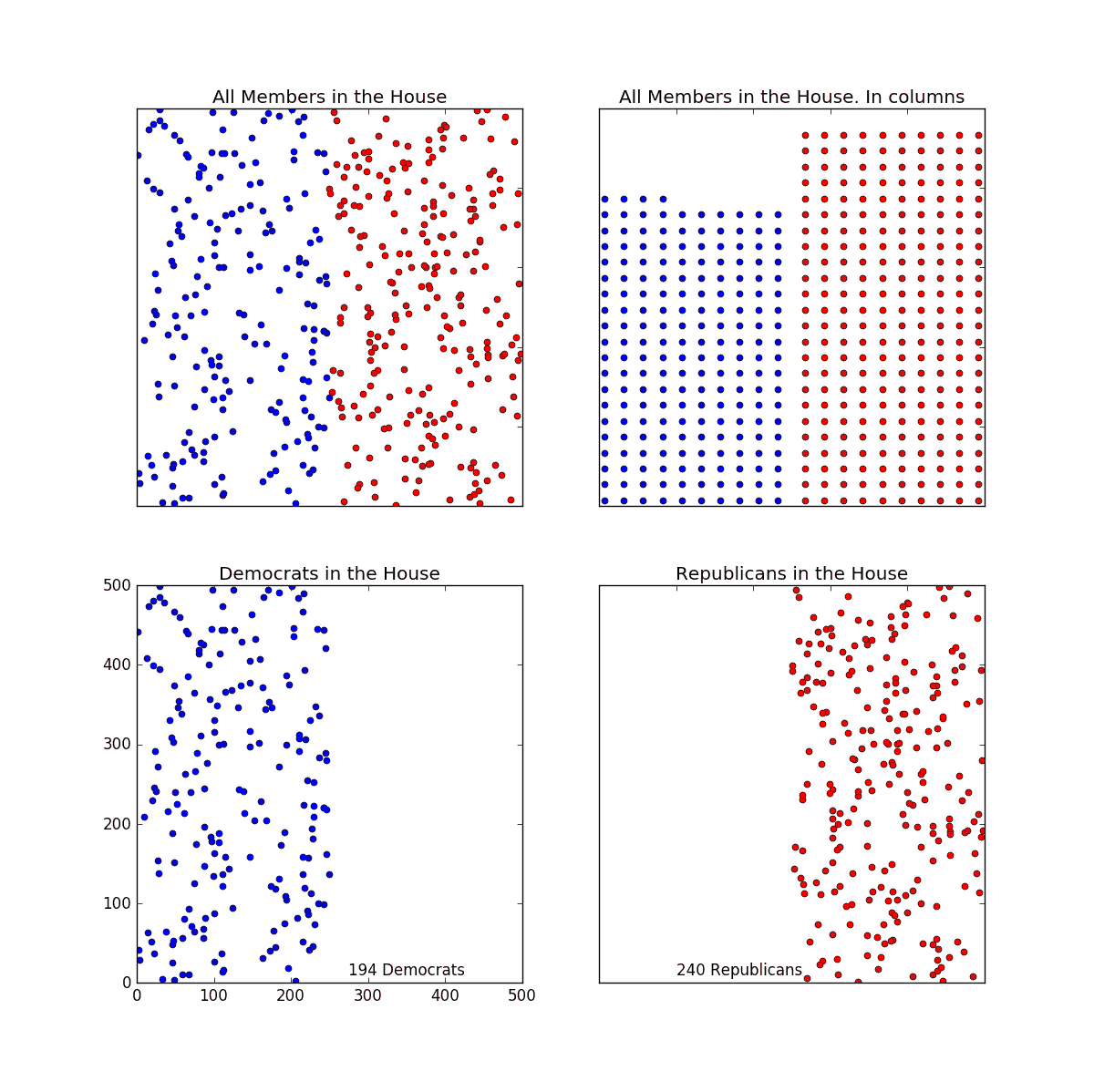
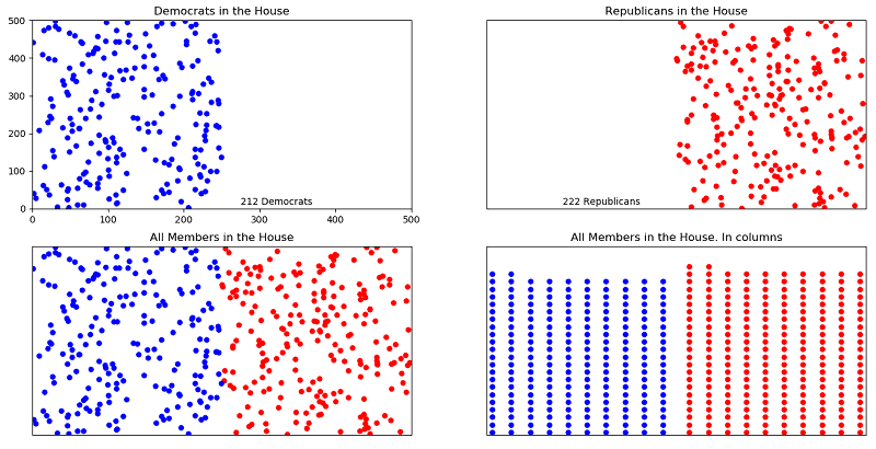
Here’s an attempt, Figure 1, to visually complement the first part of the post. The top box shows the entire House considered as one. The bottom two boxes how the House with the Democrats, on the left of course, and the Republicans on the right. The important notion for me is that now I have the idea programmed in python, I can change the way I present the data very easily, For instance, instead of separating the parties, I could randomly mix them across the whole House or I could align dots in columns as red and blue platoons.
It makes me smile to develop little improvements that can enhance a verbal discussion with an apt visual representation of a key point.
These boxes are a good starting point in my search for a good image to augment my future political post.
Code Fragment
By the way, the code below is quick and dirty. Perfect for a quick effort, not a deliverable product.
#majority_of_majority.py
#Sep. 17, 2017 Robert Hamill.
import matplotlib.pyplot as plt
import random
random.seed(a=2.718)
# def Republicans points
repub_x=[]; repub_y=[] for i in range(240):
x = random.randrange(250,501)
y = random.randrange(501)
repub_x.append(x)
repub_y.append(y)
dem_x=[]; dem_y=[] for i in range(194):
x = random.randrange(0, 251)
y = random.randrange(501)
dem_x.append(x)
dem_y.append(y)
fig = plt.figure(figsize=(12,12))
plt.subplot(221)
plt.title(‘All Members in the House’)
plt.plot(repub_x, repub_y, ‘ro’, markersize=5)
plt.plot(dem_x, dem_y, ‘bo’, markersize=5)
plt.axis([0, 500, 0, 500])
plt.tick_params(axis=’x’, bottom=’off’, labelbottom=’off’)
plt.tick_params(axis=’y’, left=’off’, labelleft=’off’)
plt.subplot(224)
plt.title(‘Republicans in the House’)
plt.plot(repub_x, repub_y, ‘ro’, markersize=5)
plt.text(100, 10, ‘240 Republicans’)
plt.axis([0, 500, 0, 500])
plt.tick_params(axis=’x’, bottom=’off’, labelbottom=’off’)
plt.tick_params(axis=’y’, left=’off’, labelleft=’off’)
plt.subplot(223)
plt.plot(dem_x, dem_y, ‘bo’, markersize=5)
plt.title(‘Democrats in the House’)
plt.text(275, 10, ‘194 Democrats’)
plt.axis([0, 500, 0, 500])
plt.show()


1 thought on “Python Program, Displaying the Majority of Majority”